
CLIENT
services
Visual Identity
Scope
4 Weeks (January - February 2023)
Role
Freelance Visual Designer for Courtney Kim Studio
Stakeholders
Alana W, Co-Founder at Booop
Reiko O, Developer at Booop
John D, Copywriter at Booop
Deliverables
Brand Guidelines
Booop is a B2B tech startup revolutionizing the retail shopping experience. By blending cutting-edge technology with a playful brand identity, Booop enables seamless self-checkout, informed purchases, and a personalized shopping journey.
Impact
5x
increase in Brand Recognition
124%
increase in Brand Engagement
67
Net Promoter Score (NPS)

Challenge
The challenge was to craft a compelling brand identity that would engage Gen Z and millennial shoppers, emphasizing the app's innovation, ease of use, and transparency.
Solution
Our design solution positioned Booop as a fresh, innovative force in retail tech, ensuring brand distinction and enhancing user engagement.
Logo
The dynamic, circular shape conveys ease, speed, and forward momentum, reflecting the app’s seamless shopping experience.

Wordmark

Brandmark

Construction

Typography
A duo of typefaces was selected to align with Booop’s youthful and tech-savvy appeal:
Fredoka – Rounded, playful, and friendly
Poppins – Bold, clean, and highly readable
Supporting 130+ languages, this typography choice ensures global accessibility with clear communication worldwide.
Foundry
Google Fonts
Style
Sans Serif
Weights
Medium
Foundry
Google Fonts
Style
Sans Serif
Weights
Regular
Medium
Semibold
Colour Palette
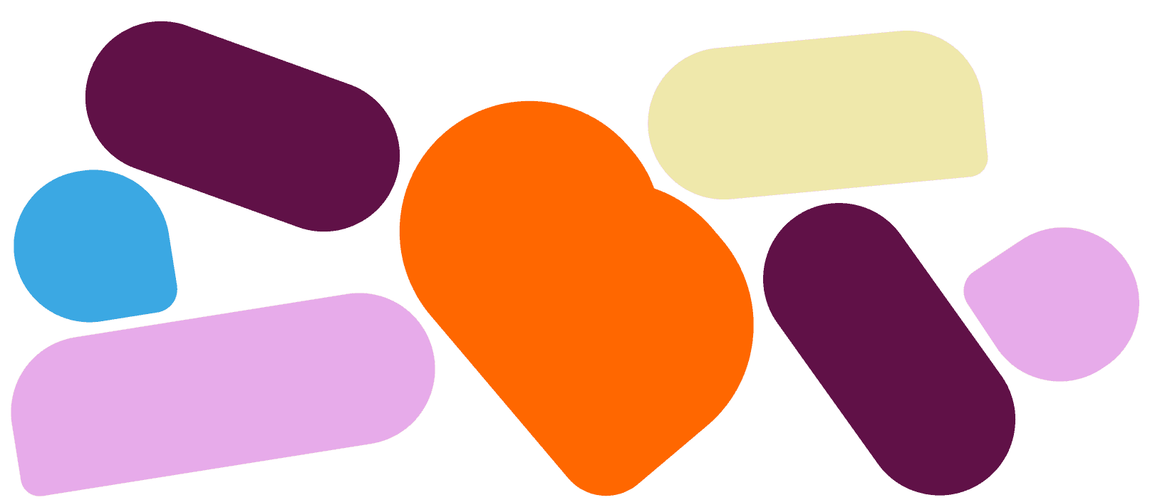
The core brand colours—Orange & Deep Purple—reflect energy and innovation, while the secondary palette of Lilac, Pastel Lemon, and Sky Blue emphasizes diversity and inclusivity.
Orange
HEX
#FF6700
RGB
255, 105, 0
CMYK
36, 28, 43, 0
Deep Purple
HEX
#601147
RGB
96, 17, 71
CMYK
64, 64, 65, 60
Lilac
HEX
#EAB4ED
RGB
234, 180, 237
CMYK
6, 7, 6, 0
Pastel Lemon
HEX
#EFE8AB
RGB
239, 232, 171
CMYK
6, 7, 6, 0
Sky Blue
HEX
#43B1E7
RGB
67, 177, 231
CMYK
64, 64, 65, 60
Grey
HEX
#606060
RGB
96, 96, 96
CMYK
64, 64, 65, 60
White
HEX
#FFFFFF
RGB
255, 255, 255
CMYK
0, 0, 0, 0

Shapes & Patterns
Inspired by Booop’s disruptive vision, we introduced speech bubble motifs to highlight key messaging and spark engagement.


"Feel free, have fun, and be in control of your shopping experience."
Booop’s tone is friendly, concise, and engaging, ensuring clear communication without corporate complexity.


Summary
KEY LEARNING #1
Don't overlook interactive user testing on visual identity projects.
Evaluating how our users would navigate and feel about the visual identity on a mock website or app, rather than static graphics, would have provided valuaable insights into how the visual language is perceived in dynamic environments. While time-consuming, this approach would have allowed us to refine the design based on real user feedback.
KEY LEARNING #2
Substantiate company research
It's crucial to verify and substantiate generative research produced by a company before embarking on a project. Conducting this research independently or through a third-party source can uncover alternative perspectives, significantly influencing the project's direction.
COMPANY FEEDBACK
"We're so pleased with the vibrancy of the brand. Our new visual identity has enabled us to target the audience we needed to capture and provide the foundation to springboard our brand to the market".

Alana W
Co-Founder at Booop
